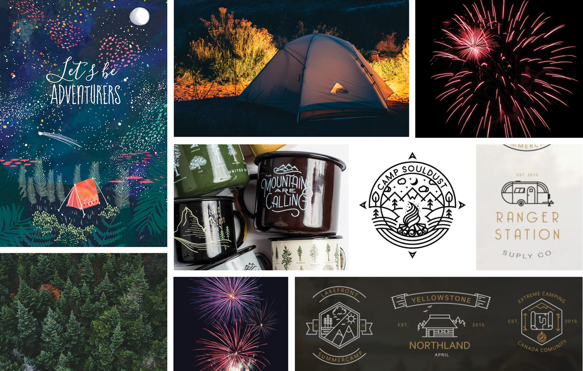
The mood board emphasizes playfulness, subdued tones with bursts of color, and rustic type.
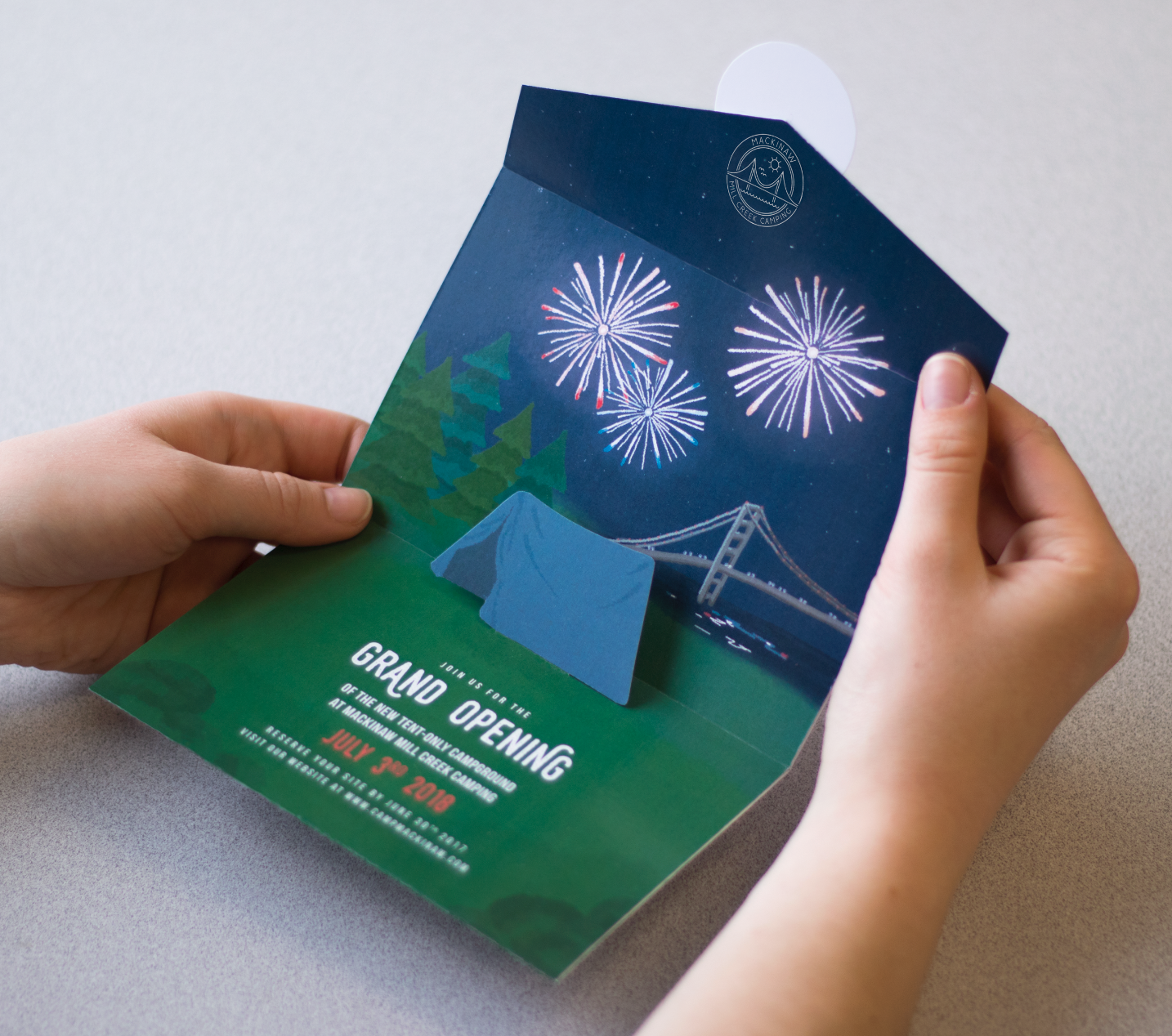
I explored different camping invitations such as a card that folded like a tent, but when I realized that other people might not read it as a tent, I decided a pop-up approach would make more sense and inspire more people to reserve a campsite.
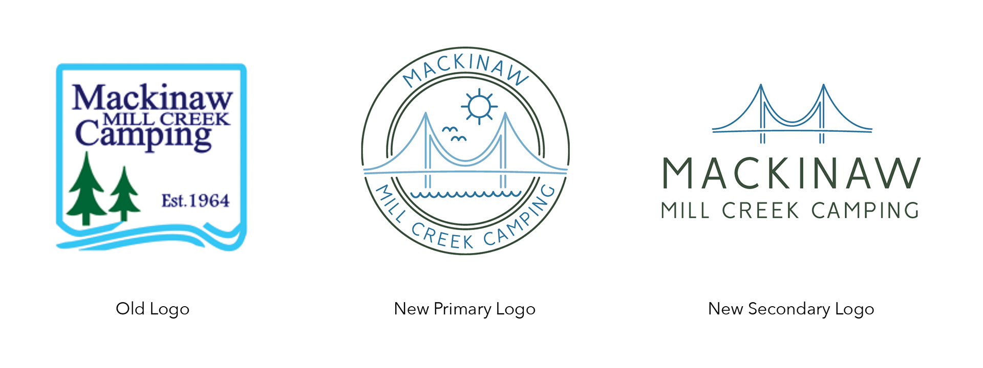
I updated the camp's logo to a more modern design and included the Mackinac Bridge as a defining feature that campers can view from the campground. In the logo, I emphasized the “M” shape in the bridge.
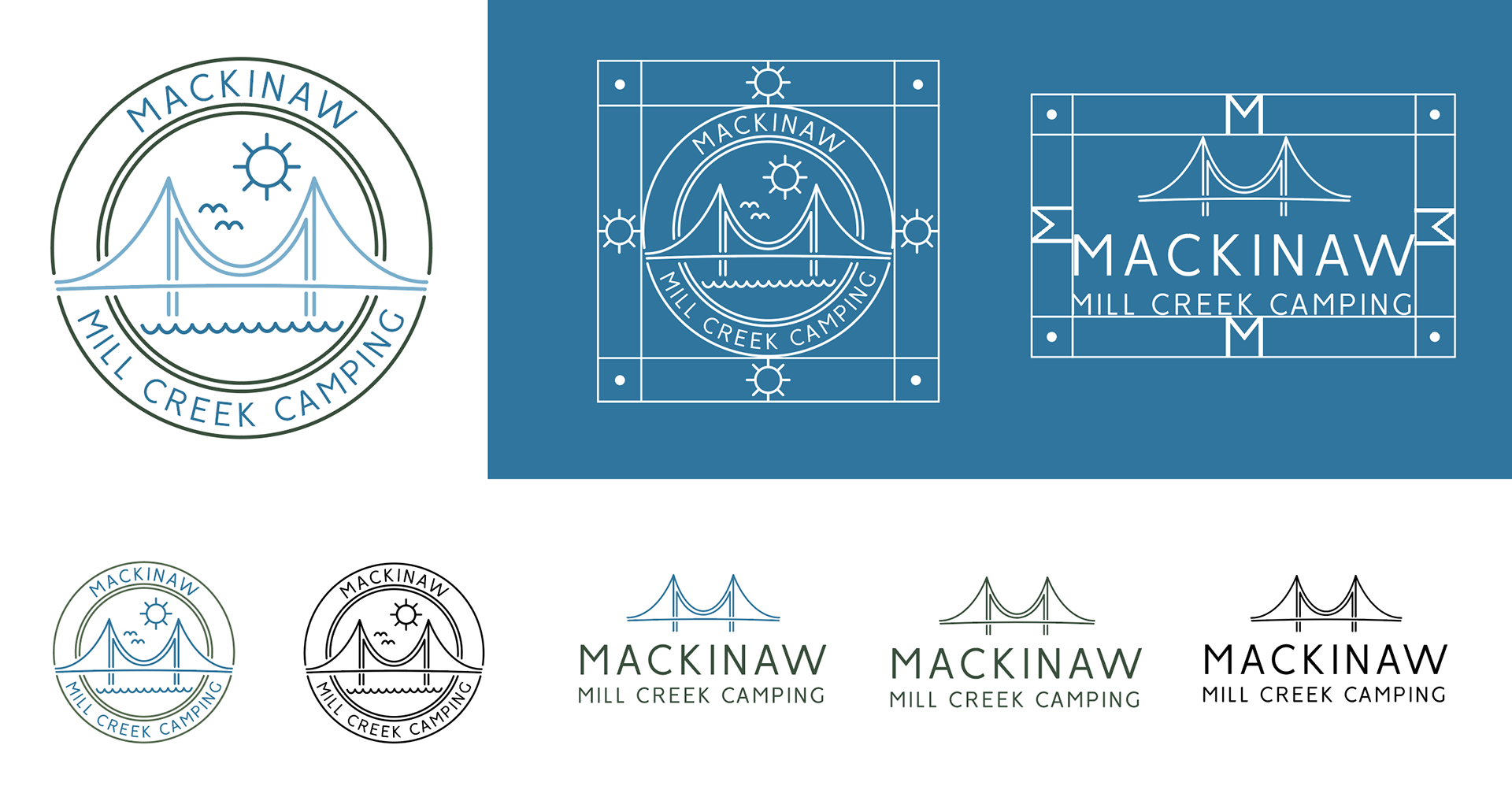
I created clear space and color variations for the primary and secondary logos.

The typography matches the clean lines of the logo. The colors coordinate with nature and give the camp a rustic mood.
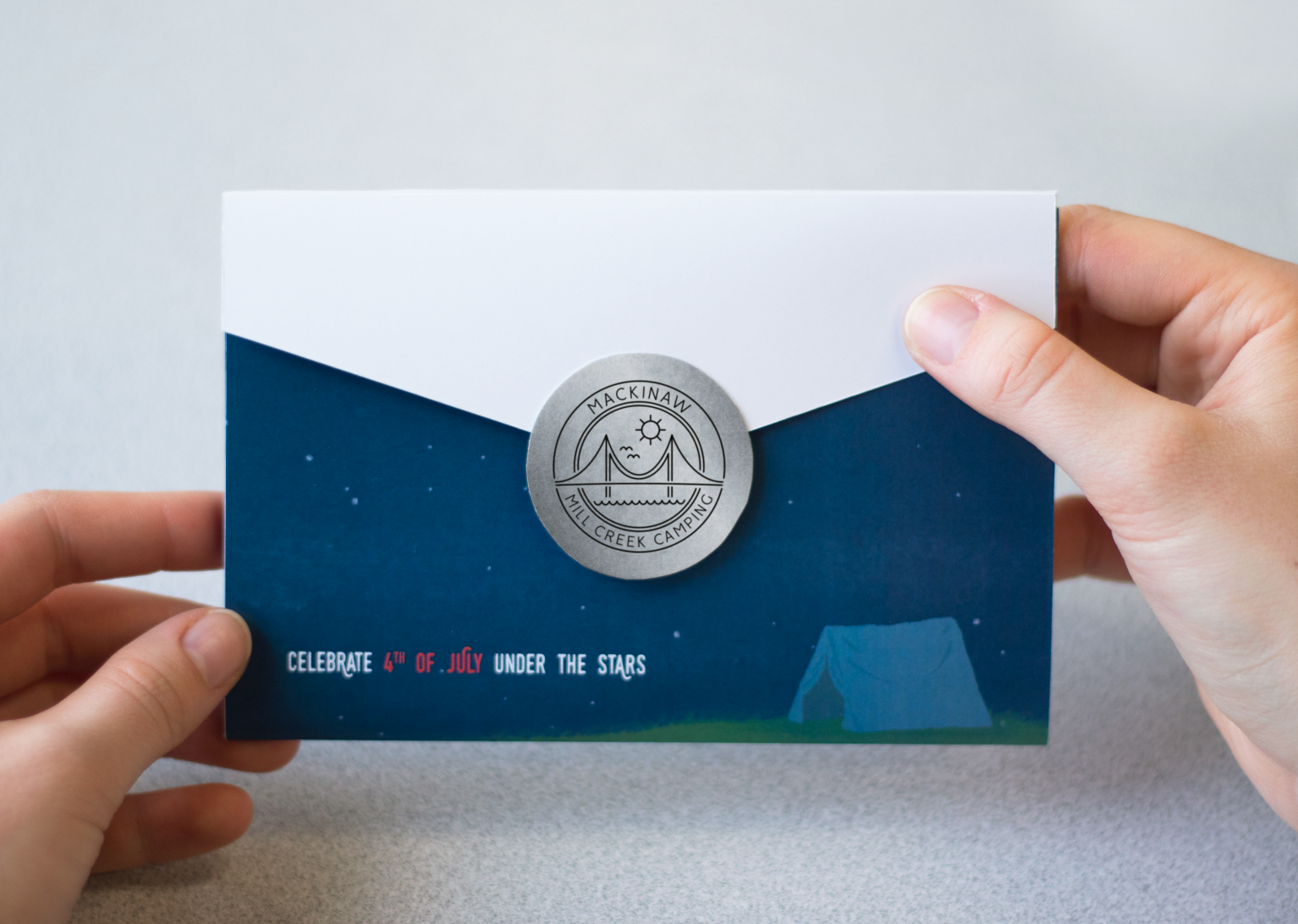
I designed the front of the invite to draw the viewer in with the call to action.
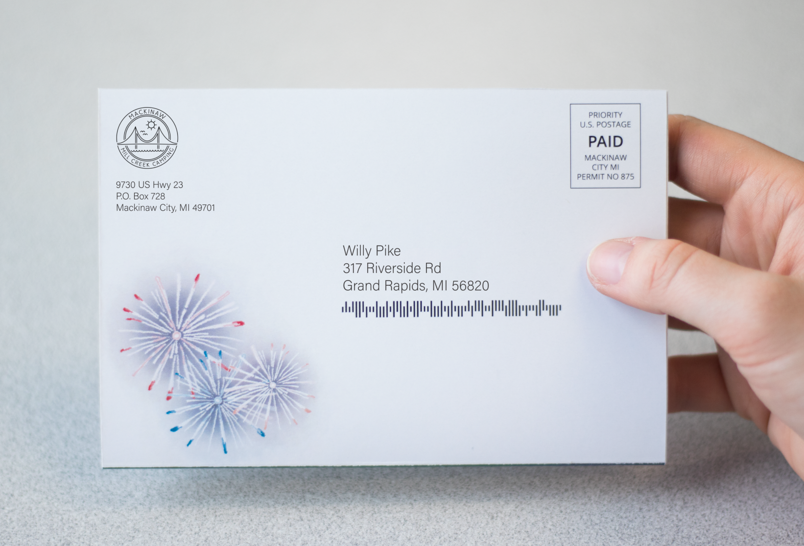
I kept the address side simple to give more emphasis to the other side where it opens.

The invite includes a link to their website and I reimagined what the home page would look like. The top image is a carousal highlighting the grand opening and being named Michigan’s favorite campground.
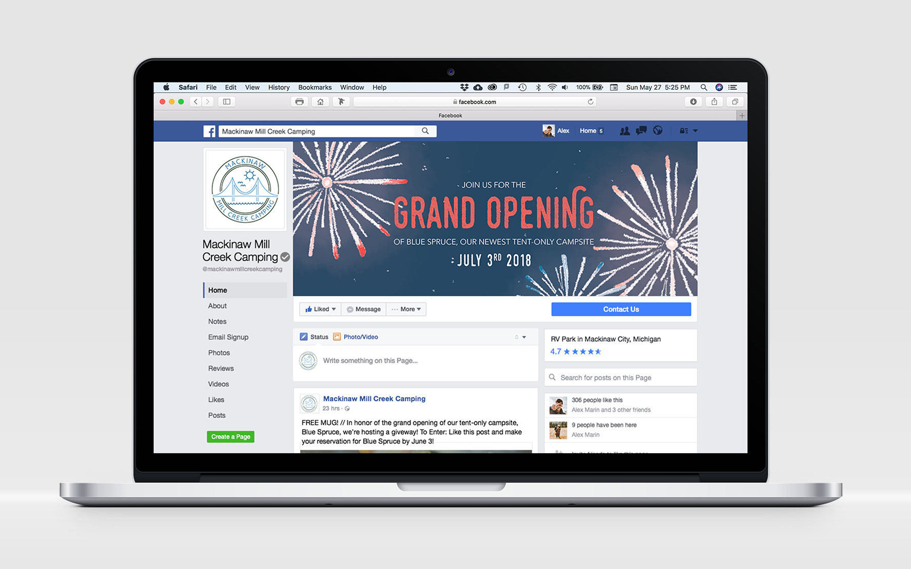
I extended the grand opening campaign to Facebook.

I also imagined the camp advertising their campaign on X and Instagram.