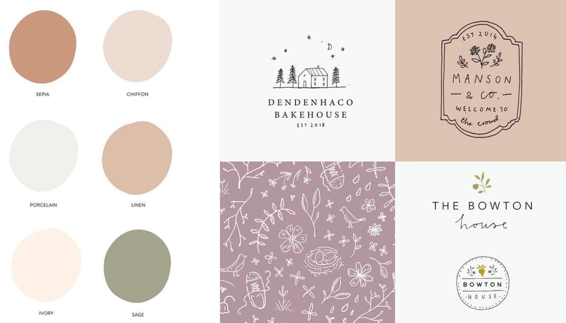
This neutral color palette by Ezer + Pine fit with my client’s minimalist goals. We also talked about visual inspiration such as logos by Ryn Frank and a pattern I had designed.
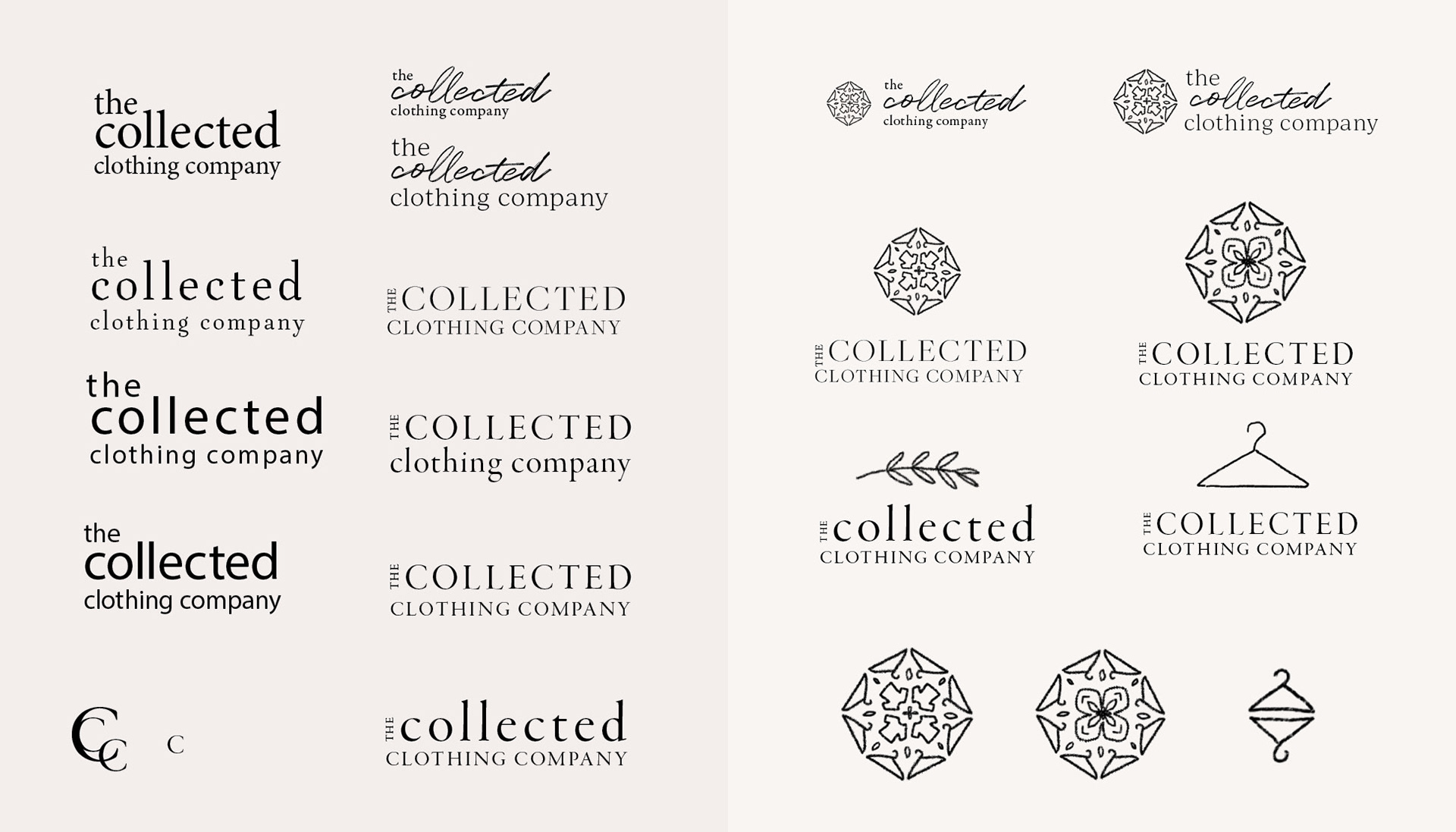
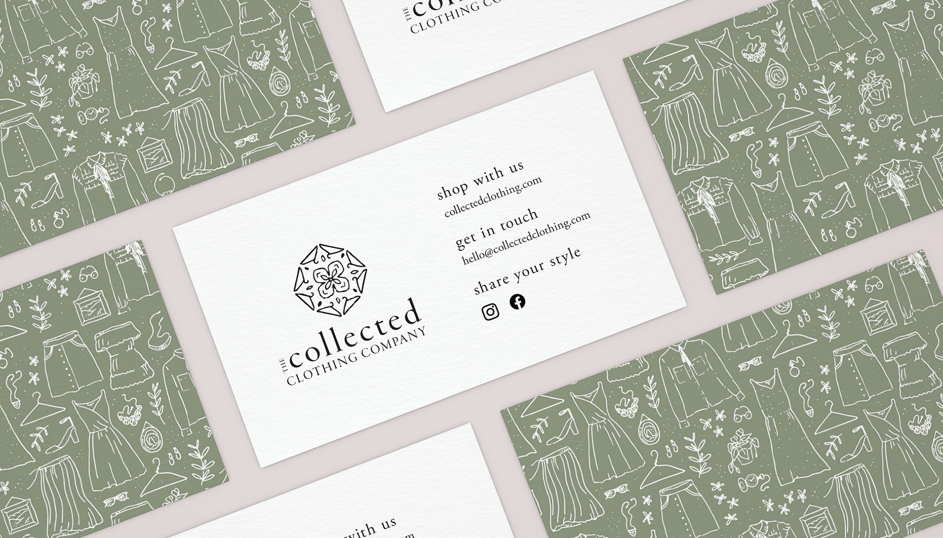
We discussed creating an icon that included clothing or similar elements. My client also liked mandalas and wondered if I could also incorporate one as well. I played with those ideas and created the hanger mandala icon in a few hours.
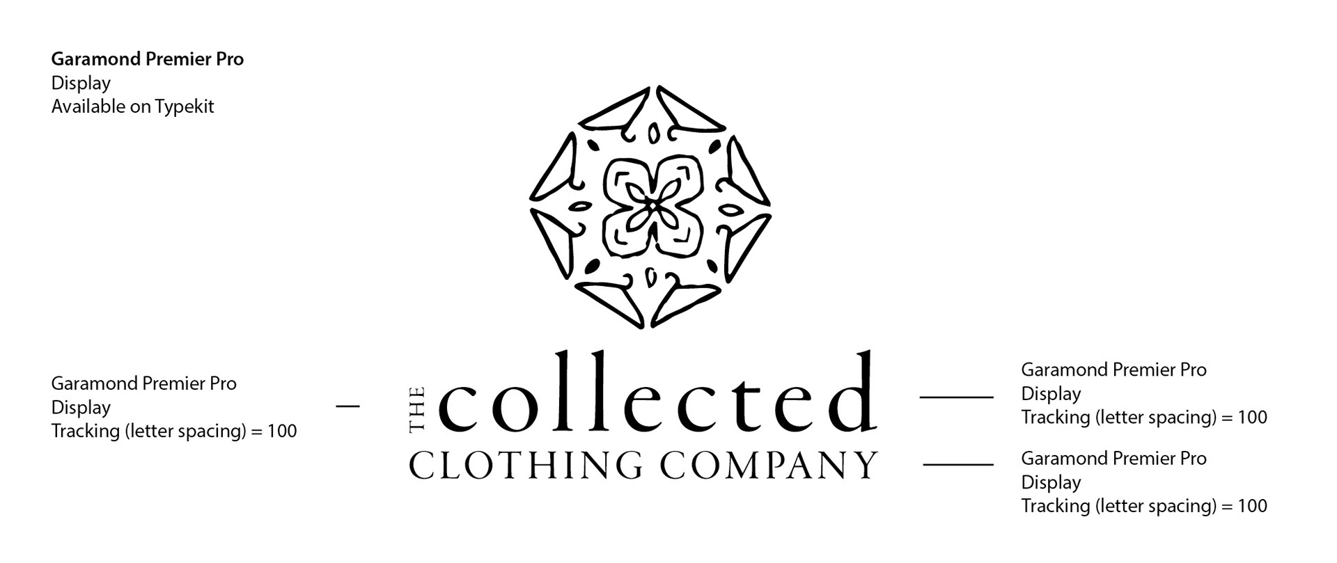
I shared this detailed type information with my client so she could create coordinating branding as needed.
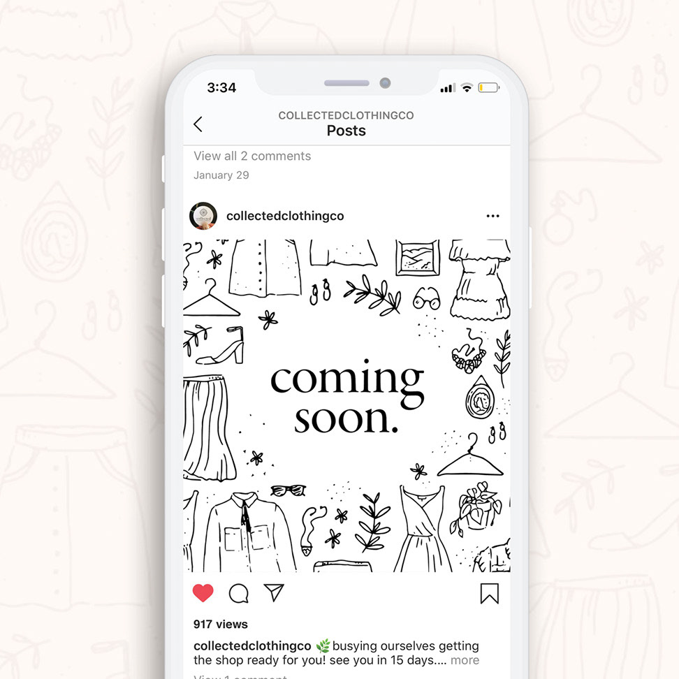
Coming soon.

Coming soon.
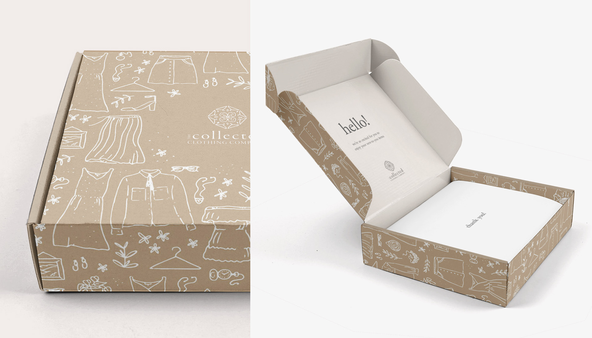
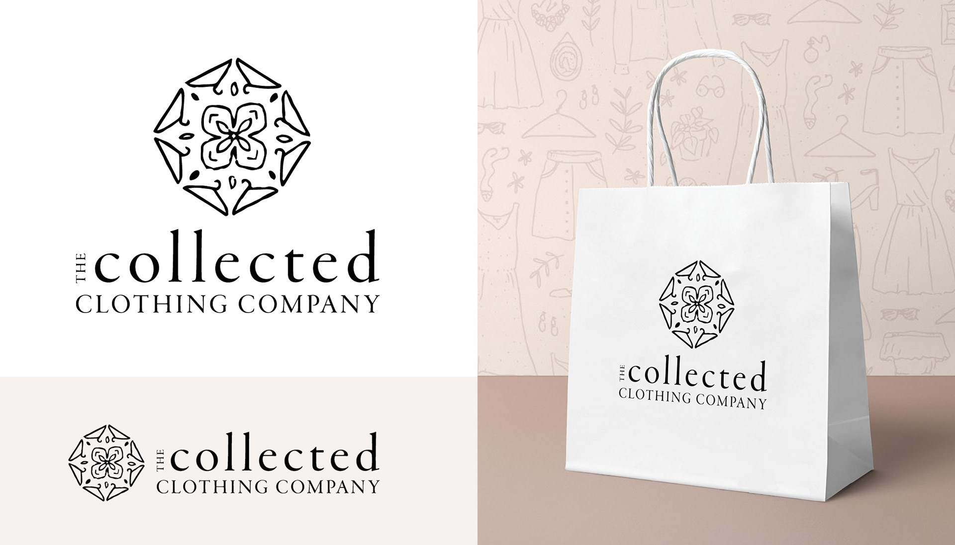
I imagined what the packaging might look like and created a kraft brown box with the pattern. The kraft brown communicates sustainability, matching the reusing nature of the company. And I added the white pattern to subtly brand the box.